


Project brief: Wacky laboratory
+ Working as a commercial illustrator 🔬

Did you know that apart from doing this weekly newsletter, I also work as a commercial illustrator?
I’ve been doing it since around 2020, when I decided to go freelance. I’ve had clients across a bunch of different industries and work in a variety of styles and mediums. It’s not my full time job, but I get a good number of projects walking through the door.
I wanted an excuse to write about some of my favourites, so this is the first ‘project brief’ post where I look back at some of the commercial work I’ve done that I’ve really enjoyed making.
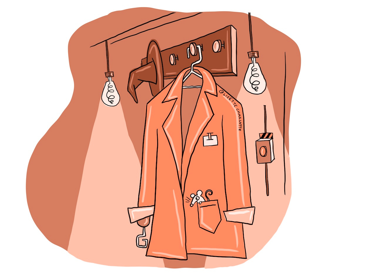
Co-design, but make it weird
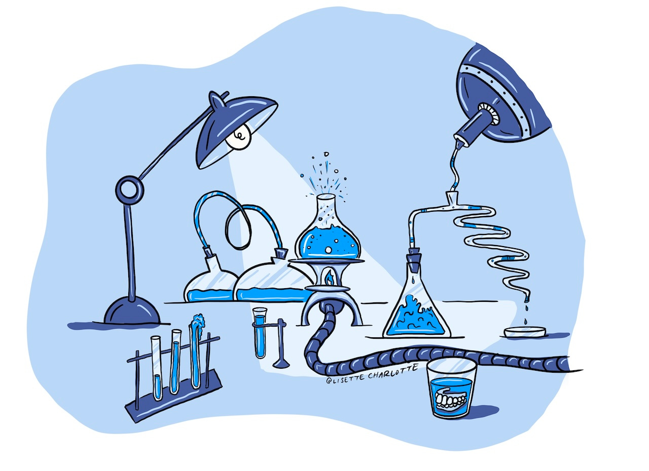
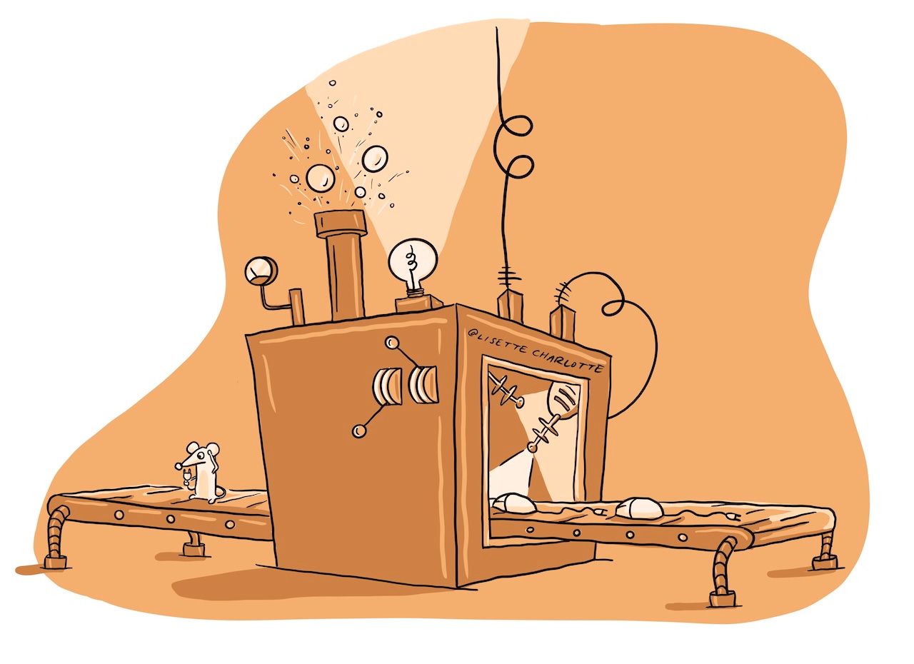
This first one was for a learning design company called Culture Hero. They had a client they were taking on a big co-design journey to create a digital learning platform. As part of the process, they wanted a visual representation of each of the teams that would be working on the different parts of the project. The project was about play, so I was told to make it as fun as I wanted to!
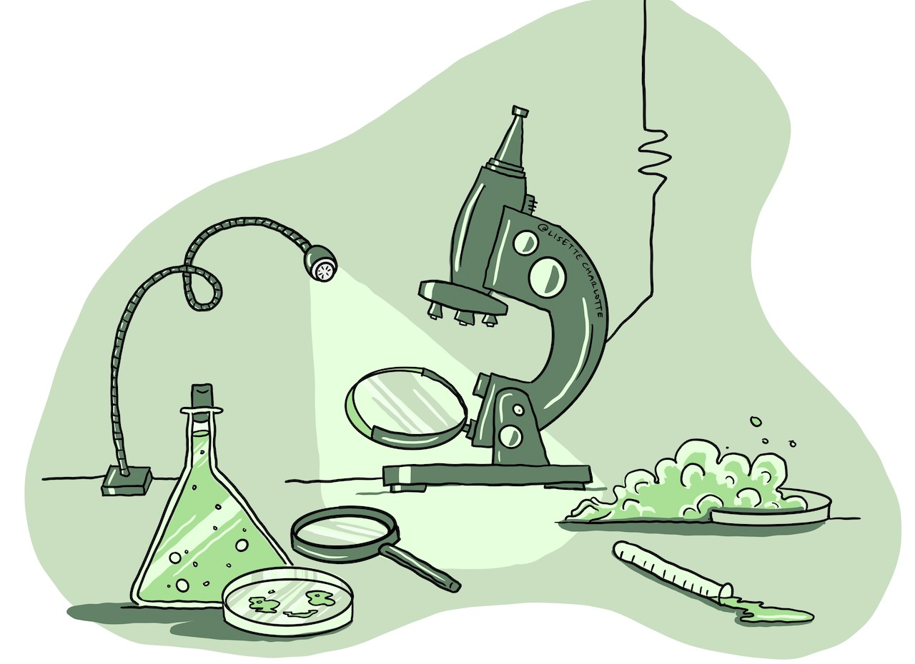
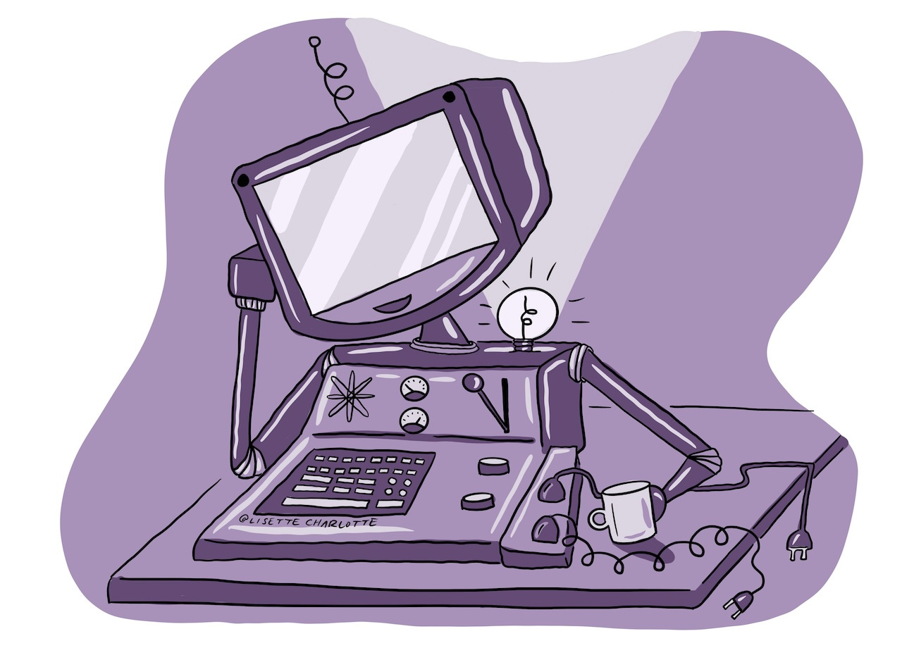
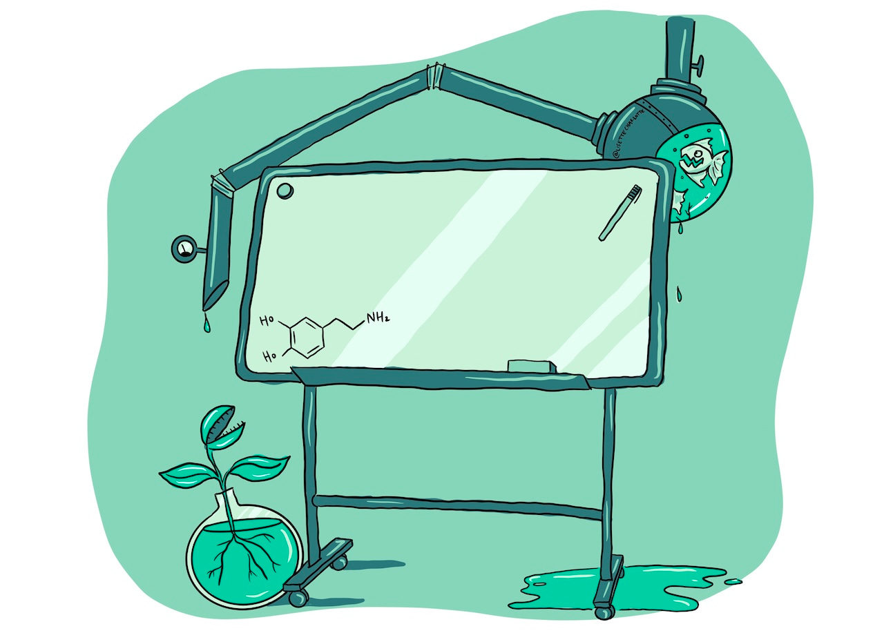
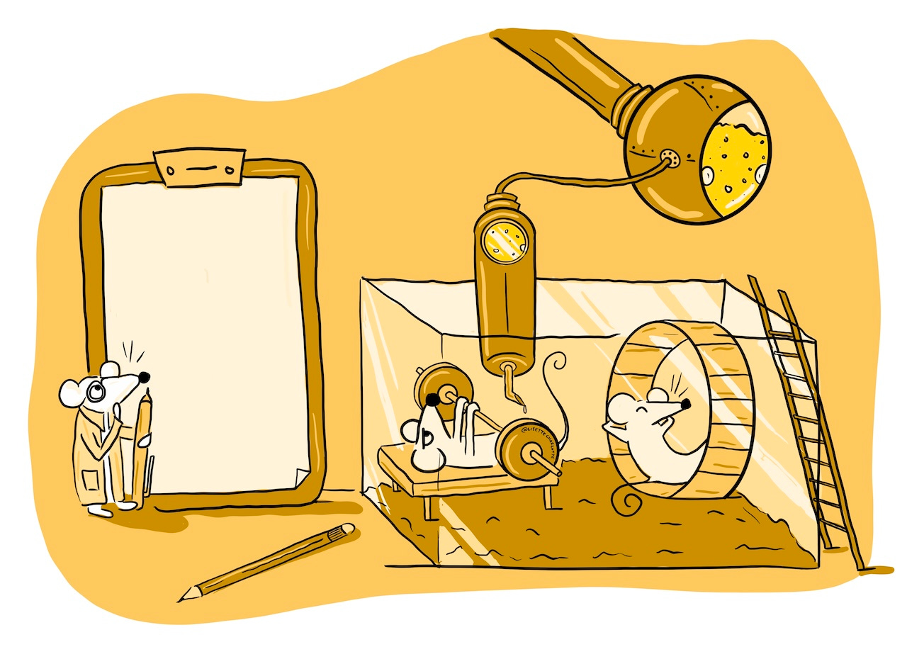
I thought that the process of co-design is like a big experiment where you don’t know what’s going to be the final result. I came up with the idea of a Dexter’s Lab kind of laboratory where everything was just a little bit weird and funky, and something entirely new could come crawling out of it.
Fast & furious
It was a quick turnaround project, with the client needing the images within the space of less than a week. I remember being in the car on a drive around the island and barely looking up from my tablet!
At one point, I somehow lost one of the layers with my final line work on one of the images. I think I nearly cried when I realised I’d have to re-do it with not much time left until delivery and SO MUCH left to still do.
Style & palette
I was making up the style on the fly and really liked the steampunk/retro technology vibes that were evolving, with clouds of steam, bubbles, and lightbulbs coming out of computers and control panels. The colour palette was pulled from the project branding which I built out with a shadow and highlight colour to give a bit of depth to each image.
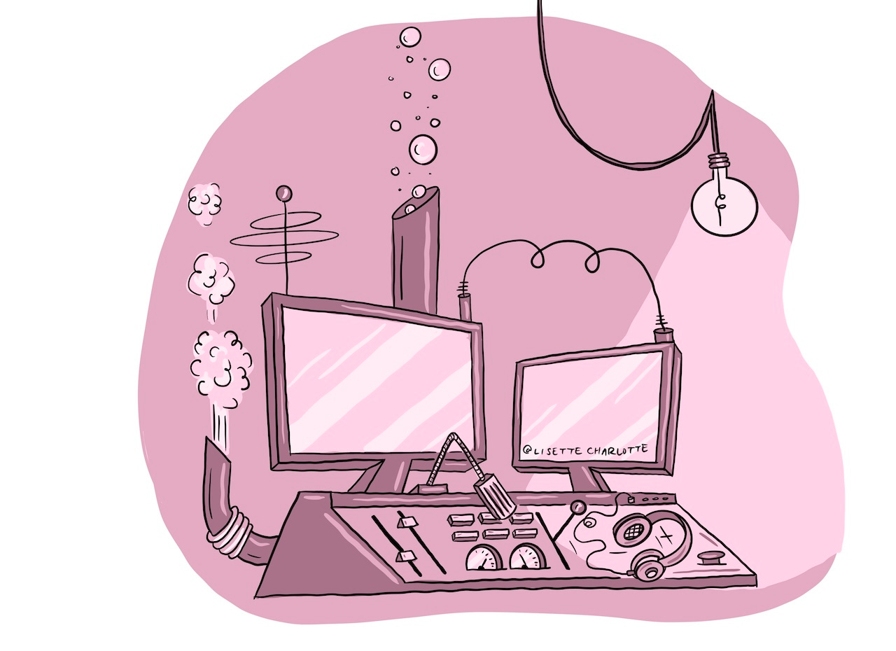
I tried to inject a bit of humour into each scene, such as the smiling petri dish, the mouse coming out of the conveyor belt, the carnivorous fish and plants, the random dentures in a glass.
Having fun with it (on a tight deadline)
It’s not often that a project flows so easily, with concepts coming to me straightaway and the finished product looking pretty slick straight out of the gate. On most projects I end up in the ‘pit of despair’. The pit of despair is when everything looks terrible and I’m convinced I’m a fraud who should never have attempted this illustration thing in the first place.
Sometimes having a tight deadline can be a blessing in disguise as you don’t have time to wallow in the pit and overthink things. You’re so focused on getting the thing done in time that it just… somehow happens. Honestly, I wish more projects flowed this easily!
Looking back on this project, there are a few things I’d have changed if I had the time, but overall I think they hang together really well. The style was a bit of a stretch for me at the time but I like what came out of it. The project was done using Procreate on an iPad Pro.

Hope you enjoyed this departure from my regular content. If you’re looking to work with an illustrator or want to chat about a project, get in touch with me via my website!
Love the colours, your drawing style and humour. Great talent!