


Project Brief: Collide Infographic
A very fun (but somewhat complex) illo.


Hello! Welcome to my second edition of Project Brief, where I talk about my work as a commercial illustrator. You can find the first one (Wacky Laboratory) here.
This project was a doozy and I loved how it turned out, even if the process was a little challenging.
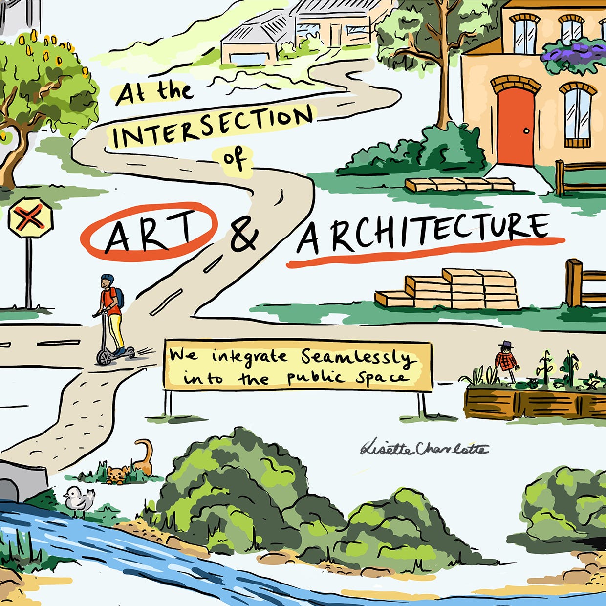
An infographic for an arts initiative
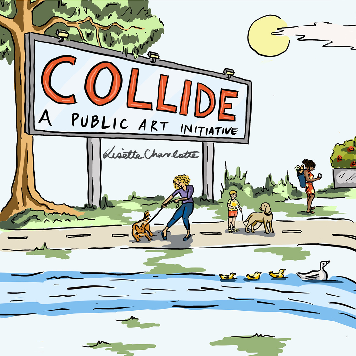
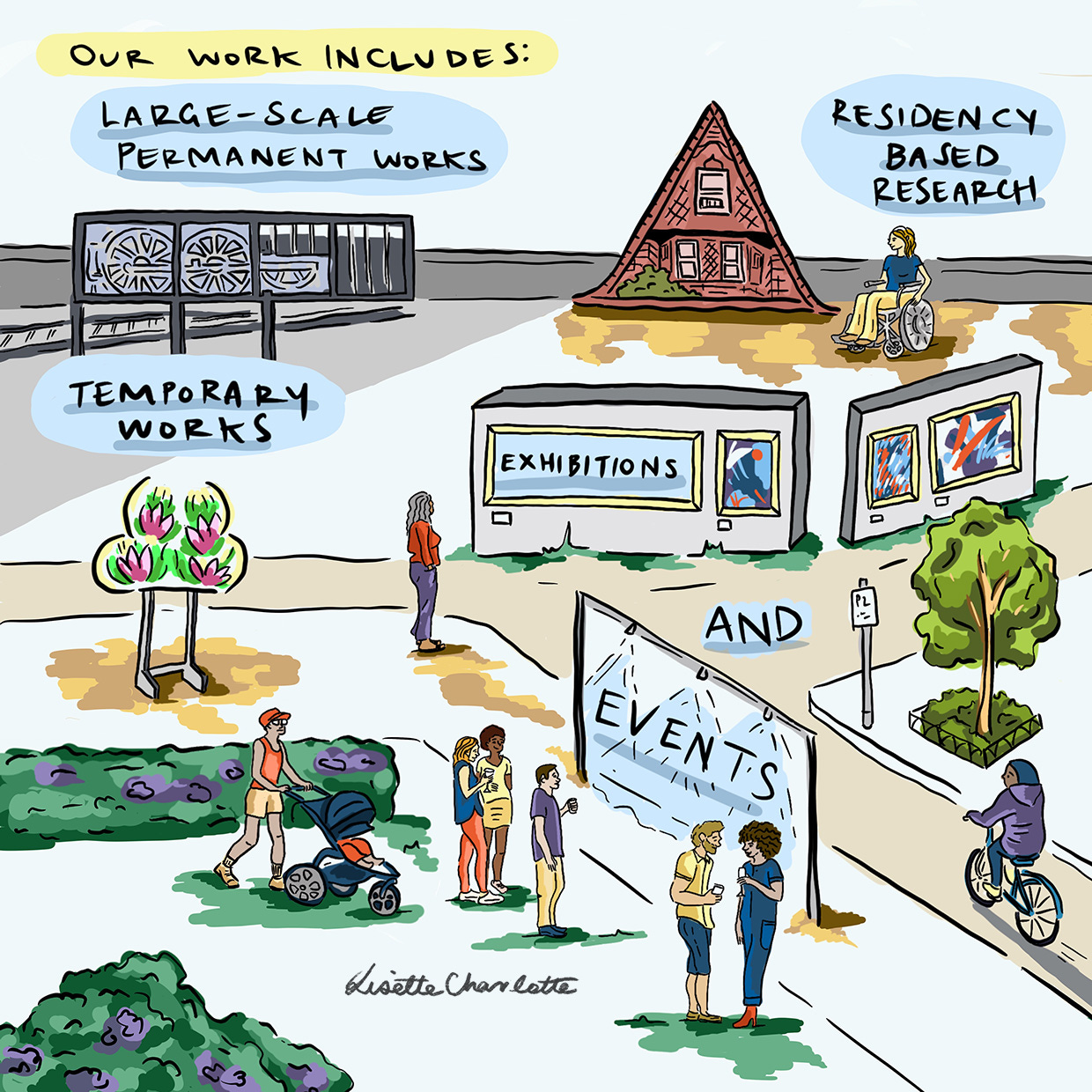
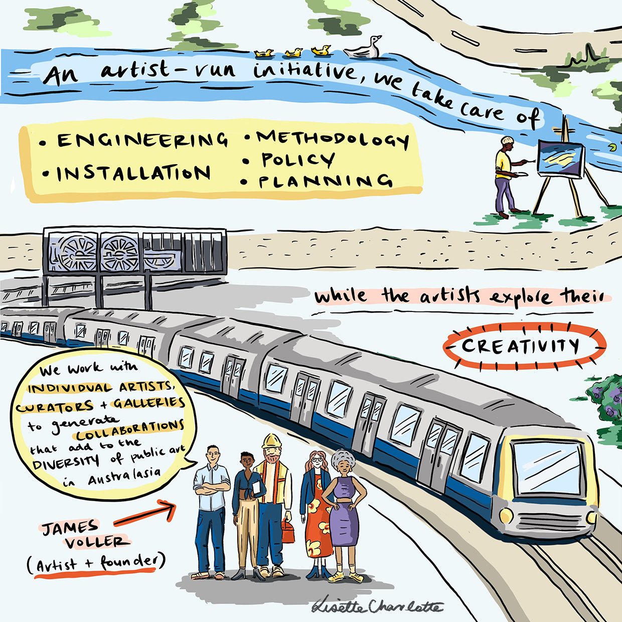
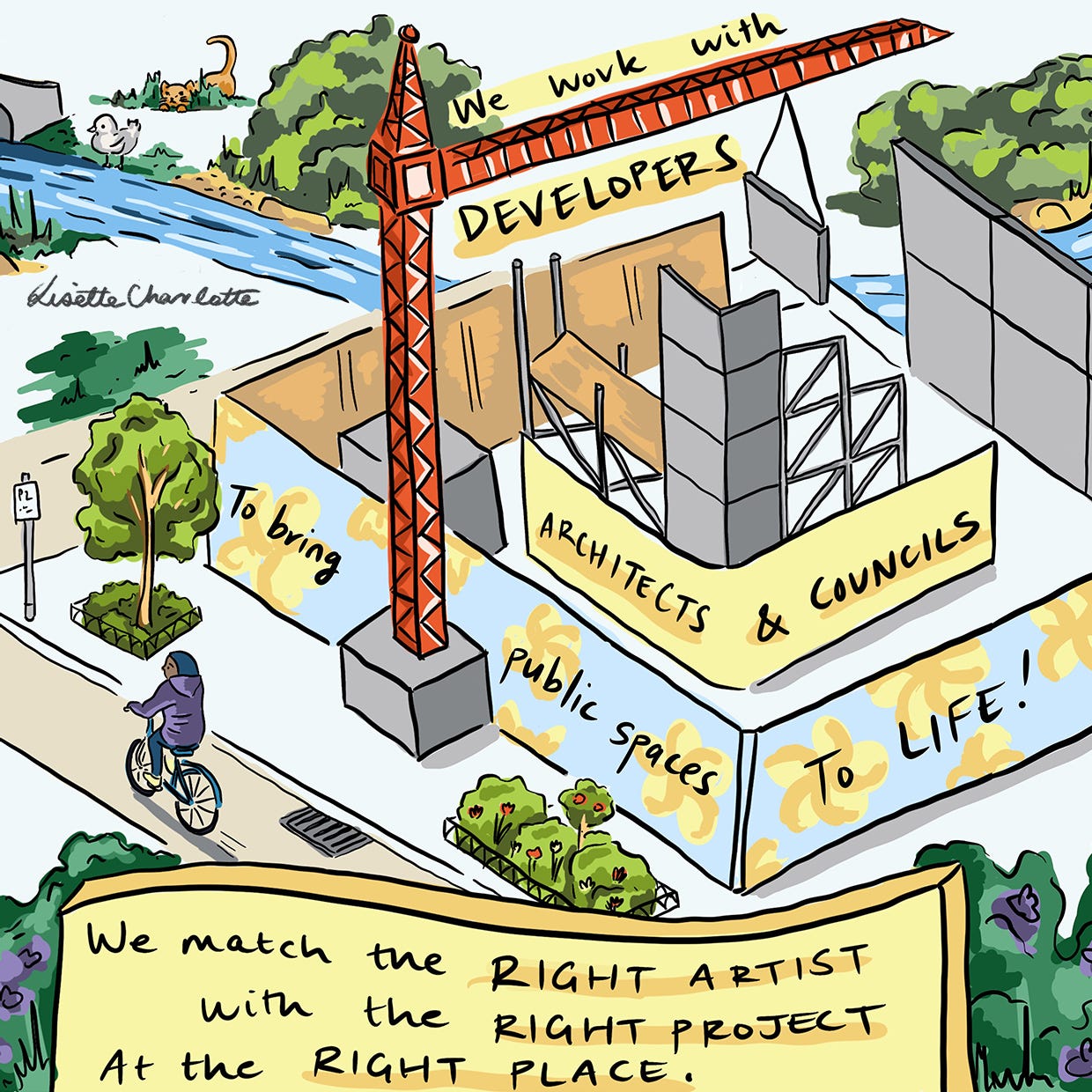
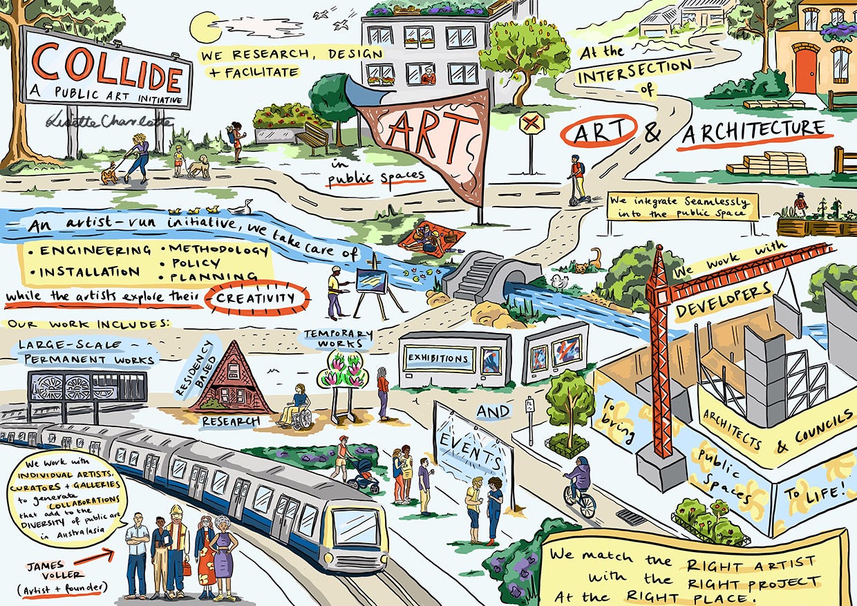
Collide are a public art initiative that were looking for a fun illustrative way of describing the business and what they do.
Because their work ‘sits at the intersection between art and architecture’, my initial thought was to create a little village that leads the viewer through the key points that the client wanted to convey.
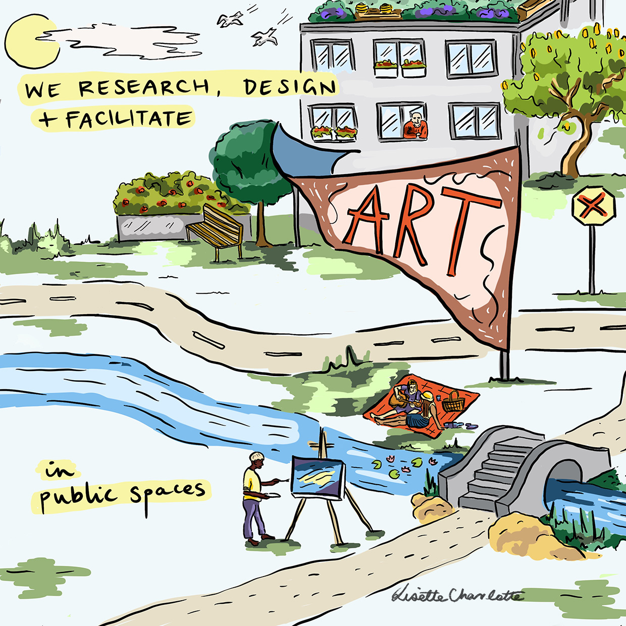
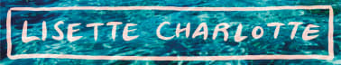
They wanted two graphics; one with all the info, and another with just the brand name and tagline. The request was to incorporate the existing artworks they’d completed where possible.
Once again taking a detour to the pit of despair
I remember vividly trying to finish this project the week we were staying in Coogee, at a tiny apartment a 10 minute walk from the beach, with the worst, rainiest beach weather known to man.
I felt like I had come up with the best idea then just had no idea how I was going to pull it off. I remember ordering myself a slice of cake and a chai latte at a cafe while the rain bucketed down outside and wanting to smack my head with the iPad.
Sometimes things don’t flow, and that’s ok
Occasionally you get in a flow state and these projects just come out so easily it’s almost like magic. Sometimes you have the sweaty pressure of a deadline and you feel like every centimetre of progress is an absolute grind.
This project was the latter. Looking back at the results, I love what I created, but there were definitely a few moments in there where I thought I was going to be going back to the client empty handed.
Playing with perspective
One of the things I think makes this illustration suite so fun, but also created a lot of headaches, is the perspective of looking down on the scene. It did result in a few characters and animals being wildly out of proportion (for example, the cat would be more the size of a mountain lion in real life, and I would not want to meet one of these giant ducks in the wild).
Overall, I don’t think that makes a massive difference to the effectiveness of the illustrations. The cartoon style is very forgiving! It’s still a lot of fun finding the easter eggs I hid in there all those years ago.
Here’s how the whole thing came together:


This is just one style of illustration that I work with. If you’re looking to work with an illustrator or want to chat about a project, get in touch with me via my website!
More like this post:
Project brief: Wacky laboratory

Did you know that apart from doing this weekly newsletter, I also work as a commercial illustrator?
Very creative. Reminds me of the Richard Scarry books I used to read to my children.
Great reflection Zette